On Saturday December 30 2017 14:01:33 Jean-Michaël Celerier wrote:

> isn't this a common complaint actually :
> https://www.google.com/search?q=qt+quick+blurry+text ?
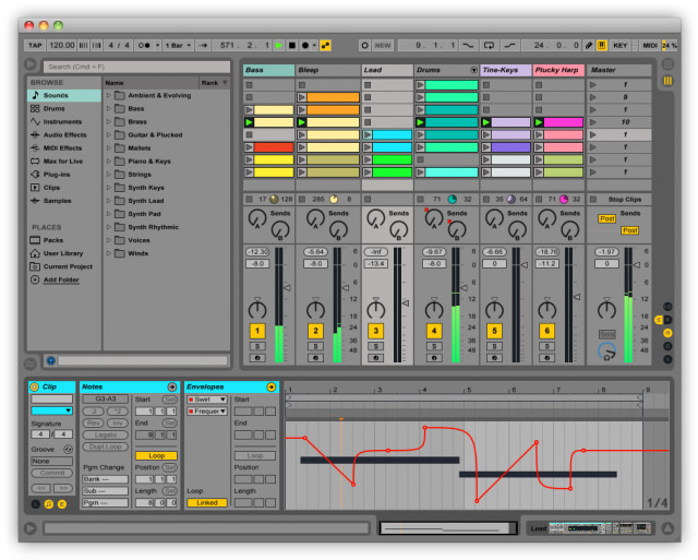
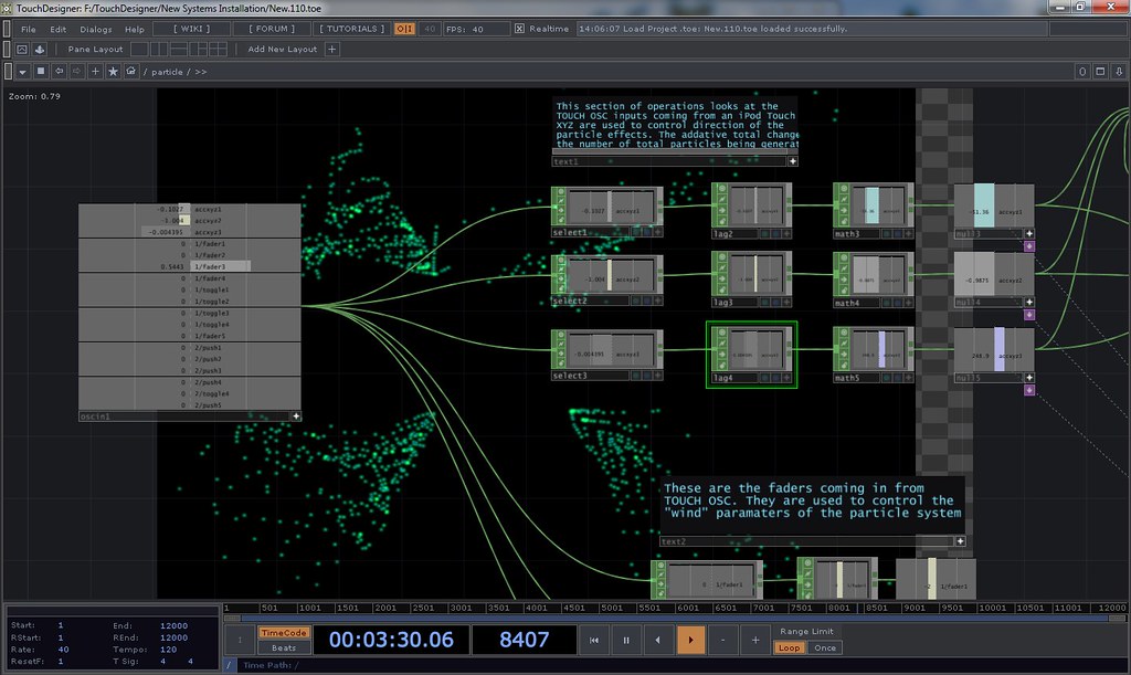
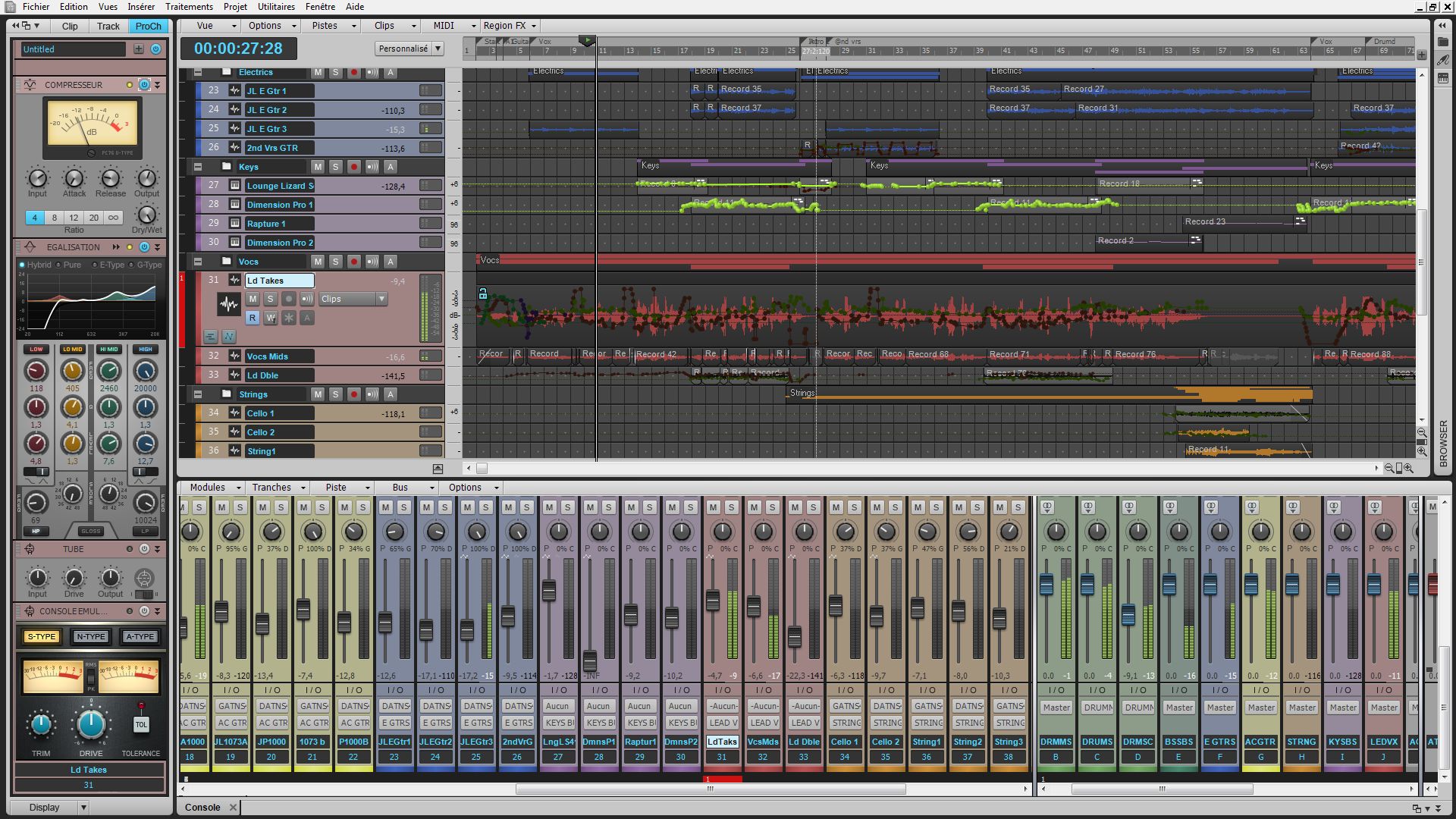
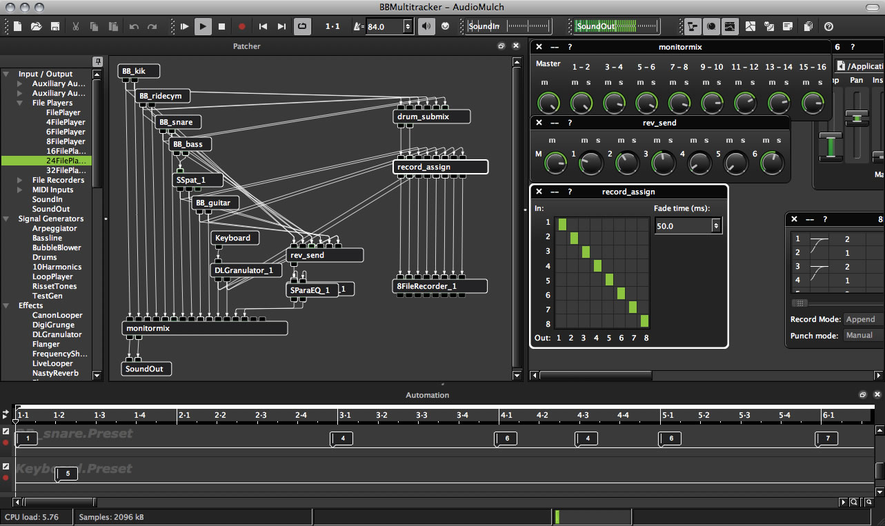
Let's put it this way: not common enough for neither the Qt nor the KWin
developers to heed? ;)

> In my case I am for instance sometimes developing small UI software with
> some buttons, list, etc... and in this case I want the app to integrate
> nicely and blend in whatever the OS and the color scheme of the user of the
> software.

Of course. But you wouldn't mind if they actually look better, would you?
(Not that that's usually the case with "vanilla" cross-platform Qt software
running on Mac; it tends to look as if designed for the visual and/or motor
impaired).

A few more screenshots:
> But the main app I work on is a music software for artists ; these
> generally have a *very strong* visual identity. We use our own CSS with
> fusion style everywhere with custom fonts, pixmaps, etc etc... and the
> software *has* to look the same (as in, pixel-perfect) on every platform
> (given same DPI of course). I honestly don't care much about the software
> integrating with the host environment; just take a look at famous software
> in this category:
>
> * Max/MSP: https://docs.cycling74.com/max7/vignettes/images/project-edit.png
> * Ableton Live:
> https://img.audiofanzine.com/images/u/product/normal/ableton-live-9-suite-163826.jpg
> * TouchDesigner:
> http://farm9.staticflickr.com/8531/8680998191_df78973538_b.jpg
> * Sonar: https://medias.audiofanzine.com/images/normal/710664.jpg
> * AudioMulch: https://static.kvraudio.com/i/b/audiomulch2-2.jpg
>
> etc... in this case it's a good thing to pop out from other software on
> your desktop (for very practical reasons, too: when you're on stage
> performing a show you don't want to spend time finding where is the window
> you have to click on, they all have to appear very distinct if you have
> multiple software running)
>
>
> Best,
> -------
> Jean-Michaël Celerier
> http://www.jcelerier.name
>
> On Sat, Dec 30, 2017 at 1:45 PM, René J. V. Bertin <rjvber...@gmail.com>
> wrote:
>
> > Nikolaus Waxweiler wrote:
> >
> > > I think you have to carefully match the rendering of CoreText (and its'
> > > darkening algorithm) for users not to notice. At that point, you might
> > > as well use CoreText, unless you have something very specific in mind.
> >
> > Remember that there's also the issue of getting the exact same font metrics
> > which is important for certain users.
> >
> > > People notice different font rendering.
> >
> > Yes - but they're not likely to complain if the different look also looks
> > better. And even then ... how many users complained about window titles
> > looking
> > blurry when KWin started using QtQuick for rendering titlebars?
> >
> > > The performance hit is measurable in the rendering benchmark tool
> >
> > Measurable in a benchmark tool doesn't mean there are performance issues.
> > I've
> > been using Infinality on a very slow system, without any ill effects.
> >
> > > consistency. Sit a Core Web font next to some random Google Font font on
> > > the internet and they'll look jarringly different, like each used a
> >
> > If you mean fonts rendered by FreeType with and without Infinality looks
> > jarringly different, then yes, that can be the case at regular point sizes
> > on
> > regular density displays. Which is the whole point: with the result looks
> > jarringly better.
> >
> > > No, incorrectly hits the mark. As soon as your rendered glyph image
> > > contains shades of gray, you MUST use linear alpha blending and gamma
> > > correction. Everything else is incorrect.
> > > The Windows and Mac platform
> > > have been doing that for decades, X11 libs never did to my knowledge.
> >
> > Erm, I'm talking about KDE desktops using Qt4 or better, which have the
> > option
> > to activate sub-pixel rendering and hinting (which will be on by default
> > IIRC).
> > Basic X11 font rendering doesn't, indeed. Instead it relied on pre-rendered
> > bitmap fonts like for a high-resolution matrix printer. And curiously those
> > fonts could be displayed 100% correct - with moiré effects and blurring
> > between
> > the display phosphor and our retina taking care of making the letters look
> > smooth enough to be pleasant. I still use some fonts like that (Monaco in
> > particular) in my xterms, that I've been preserving from my PhD days on a
> > Mac
> > IIx running A/UX 2.0 .
> >
> > Either way, a long as we're talking about vector fonts rendered on a raster
> > display the term correct has a very relative meaning.
> >
> > > The CFF darkener delivers the best
> > > looking results so far, as it only counters the thinning such that the
> > > font looks as meaty as before gamma correction.
> >
> > Again, that's in the eye of the beholder, but I still find that the
> > results look
> > better with than without the Infinality patch set. The only regression
> > (due to
> > your CFF darkener or to the FT+FC patches) is in a single font family so
> > far,
> > which looks washed out with the default gamma correction. That's actually
> > due to
> > something in the FontConfig "Ultimate" patch or tweaked config files.
> > I have no idea if those are CFF fonts and can't find a reference to the
> > family in
> > the .conf files either.
> >
> > > (just look at all the fixing Infinality has to do; hinting can be a very
> > > seat-of-the-pants business)
> >
> > It is, inevitably. It's aimed at fooling human perception and as such
> > cannot be
> > an exact science (unless you're a biologist or "assimilated"
> > neuroscientist :)).
> >
> > Anyway, whether or not "we" use Infinality is not Qt's business. Or
> > rather, it's
> > not up to Qt to tell us what we should consider to look better and then
> > take
> > steps to make it impossible to use that patch set.
> >
> > The issue at hand here is whether or not Qt should/could allow users to
> > use font
> > rendering based on FreeType+FontConfig across the main platforms, with as
> > the
> > main argument the fact that this will allow (near) perfect cross-platform
> > homogeneity in text rendering. The default should evidently be to use the
> > platform native font engine (but it'd be nice if there were at least an
> > env.
> > variable for users to select their preferred engine and/or a way to do so
> > via
> > e.g. a platform theme plugin like the plasma-integration plugin or my
> > github:RJVB/osx-integration.git).
> >
> > I've posted a few side-by-side comparisons:
> > https://bugreports.qt.io/browse/QTBUG-65510
> >
> > >> I probably would if I knew how.
> > >
> > > export FREETYPE_PROPERTIES=cff:no-stem-darkening=1
> >
> > I see absolutely no difference between the two. Maybe simply because I'm
> > not
> > using any CFF fonts.
> >
> > R.
> >
> >
> > _______________________________________________
> > Development mailing list
> > Development@qt-project.org
> > http://lists.qt-project.org/mailman/listinfo/development
> >

_______________________________________________
Development mailing list
Development@qt-project.org
http://lists.qt-project.org/mailman/listinfo/development