Nikolaus Waxweiler wrote:
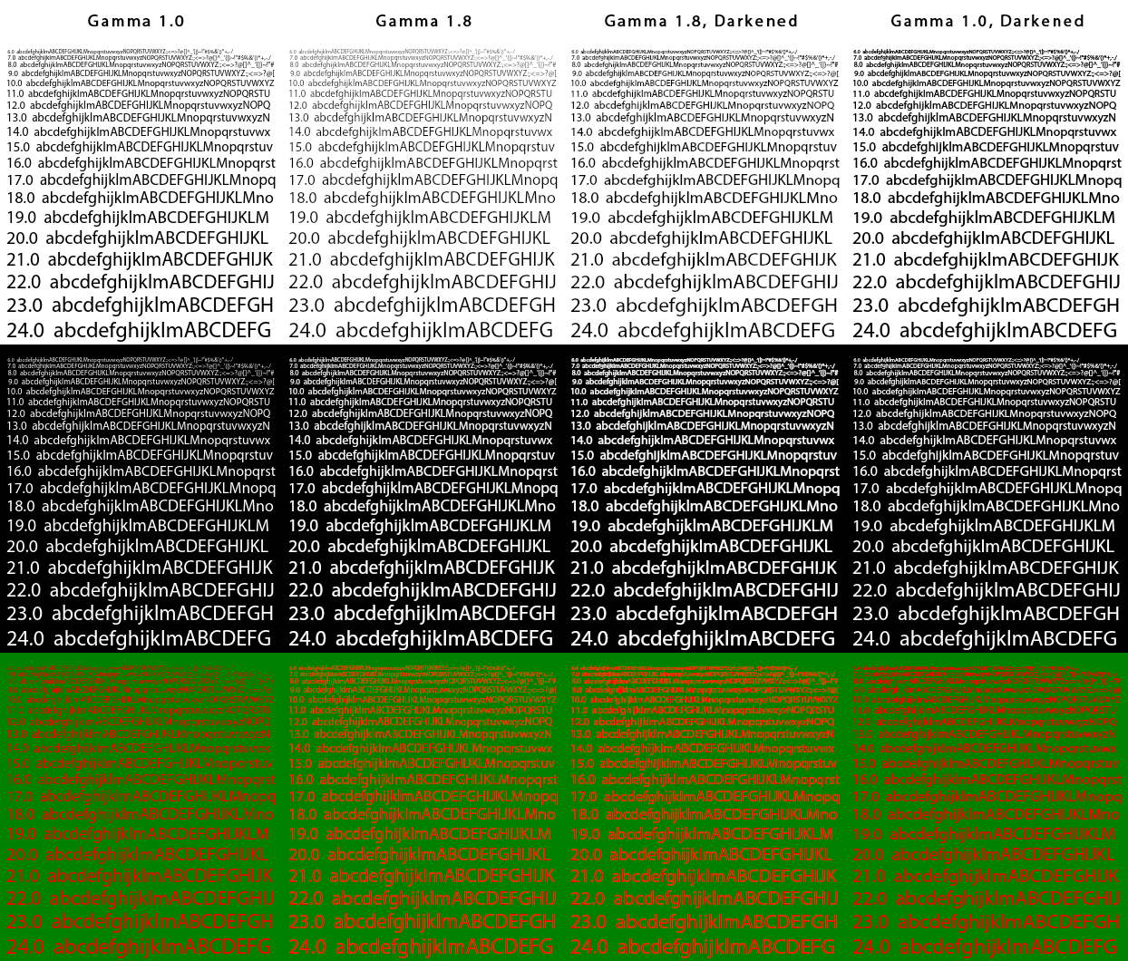
> We want to get to "Gamma 1.8, darkenend":
> https://www.freetype.org/image/BlendingExamples.png
On Mac (FT and/or FT+FC *without* Infinality+Ultimate patches) I find 1.5 comes
closer to the native CoreText font colour. 1.8 is too thin.

And for giggles, which one looks better and which more correct in this
screenshot (of 2 Konsole windows under X11)?


R
_______________________________________________
Development mailing list
Development@qt-project.org
http://lists.qt-project.org/mailman/listinfo/development