On 02/10/2014 06:36 PM, Bill Y. wrote:
> I don't like this direction, and here are my reasons:
>
> 1. The sid emulator font is a bit map font on the commodore label area
> of the banner. The font is not unique. We are already using a similar
> font for Bit Invade where it makes sense. Like Freeboy Color logo, the
> Sid logo should capture the commodore 64's case font otherwise it's
> just generic 8bit.
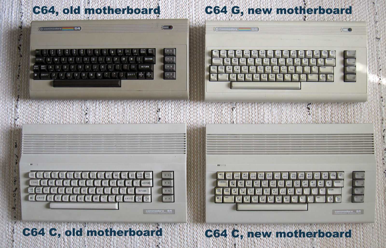
It's the actual C-64 font which is well recognizable to anyone who's
ever used a C-64.

The problem with using the case font is that unless it's done in a
photorealistic way so that it looks like it's actually written on the
case, it would just look like whatever writing on top of a photo - you
can see an example of this on the old 0.4.15 graphics, something like
this was attempted there, and it just looks like some random typeface on
top of a blurry photo.

> 2. The banner is using the C64 G label. While it is a C64 label, it
> lacks contrast due t it's pale background. The original C64 is the
> more iconic C64 casing, and it's logo has more contrast. Here are the
> 3 major cases for the C64. Again the top left in my opinion is the
> most iconic.
> http://ilesj.files.wordpress.com/2010/07/four-different-c64s.jpg

The problem is finding a usable photo of one: the photo can't have too
much distortion (small amounts can be corrected, but if there's lens
distortion it can be hard to get right), and also, the photo must be
released under a license that is suitable for our needs (eg. CC BY-SA,
no NC/ND) - or in public domain.

If you can find such a photo, I'd be happy to use it.

>
> 3. Because the C64 was an 8Bit color system it had more or less the
> same colors as any other 8bit color system. The thing that was icon of
> the C64 color wise was it's blue on blue graphics when it started up.

Agreed about the blue, but the blue-on-blue has been already overdone to
death on other C-64 instrument plugins. I think it's better to do
something different.

> With that being said, and a fresh pair of eyes, I do feel my colors
> might have a bit to much red in them. So I'm going to make a few more
> variations. One will have a bit less red, and probably more accurate
> to the original case colors, and the other will be based off the C64G
> color scheme. I will also be doing a little more detail work to make
> them look a bit more "real."

Bill, I'd much rather you'd collaborate on this project. This is exactly
the reason for the existence of the guidelines. I don't want pointless
"competitions" on mailing lists, with camps forming and people taking
sides. That kind of thing is disruptive not just to the UI team but to
the entire project. So I'm trying to come up with a more productive
solution here.

The problem is, that when you have to do things like knobs and buttons
that were not on the C-64 case, it's very hard to make it look like a
C-64 case. With the space constraints we have to work with, all the more
so... you'll likely just end up with something that looks like a generic
plugin. Nice, possibly, but not something that's really in the spirit of
the C-64.


------------------------------------------------------------------------------
Android™ apps run on BlackBerry®10
Introducing the new BlackBerry 10.2.1 Runtime for Android apps.
Now with support for Jelly Bean, Bluetooth, Mapview and more.
Get your Android app in front of a whole new audience.  Start now.
http://pubads.g.doubleclick.net/gampad/clk?id=124407151&iu=/4140/ostg.clktrk
_______________________________________________
LMMS-devel mailing list
[email protected]
https://lists.sourceforge.net/lists/listinfo/lmms-devel