Dear all,
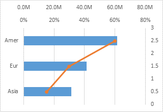
I am trying to make a similar plot -
https://peltiertech.com/images/2013-09/BarLineSampleChart4.png.
I have data for two variables; count and z by city and week. I would like
to have a horizontal bar plot of *count* by city and a line plot of weekly
average of the variable *z*.

I have tried the following:

ggplot() + geom_bar(data=dat, aes(x=city, y=count),
stat="identity",position="dodge") + coord_flip() +
geom_line(data=dat, aes(x=week, y=mean_tmin))

However, this flips the code for both the bar plot and the line plot. I
would the y-axis of the line plot to be on the left-vertical axis. I read
that it is difficult to have a secondary axis with ggplot. Any help will be
highly appreciated. Thank you!

dput(dat)
structure(list(city = structure(c(4L, 5L, 1L, 3L, 2L, 4L, 3L,
1L, 2L, 5L, 3L, 1L, 2L, 4L, 5L), .Label = c("Akron", "Boston",
"Houston", "NYC", "OKC"), class = "factor"), week = c(1L, 1L,
1L, 1L, 1L, 2L, 2L, 2L, 2L, 2L, 3L, 3L, 3L, 3L, 3L), count = c(2.8,
2.7, 3.1, 2.5, 3.5, 5.3, 4.5, 9.5, 2.7, 2.1, 4.5, 9.5, 2.7, 5.3,
2.1), z = c(-4.1, 1.7, 1.5, 12.8, 1.9, 4, 11.2, 1.4, 2, 4, 10.9,
1.4, 1.7, 3.9, 4.3), City = structure(c(4L, 5L, 1L, 3L, 2L, 4L,
3L, 1L, 2L, 5L, 3L, 1L, 2L, 4L, 5L), .Label = c("Akron", "Boston",
"Houston", "NYC", "OKC"), class = "factor"), Count = c(4.466667,
2.3, 7.366667, 3.833333, 2.966667, 4.466667, 3.833333, 7.366667,
2.966667, 2.3, 3.833333, 7.366667, 2.966667, 4.466667, 2.3),
    mean_tmin = c(2.76, 2.76, 2.76, 2.76, 2.76, 4.52, 4.52, 4.52,
    4.52, 4.52, 4.44, 4.44, 4.44, 4.44, 4.44)), .Names = c("city",
"week", "count", "z", "City", "Count", "mean_tmin"), class = "data.frame",
row.names = c(NA,
-15L))

        [[alternative HTML version deleted]]

______________________________________________
[email protected] mailing list -- To UNSUBSCRIBE and more, see
https://stat.ethz.ch/mailman/listinfo/r-help
PLEASE do read the posting guide http://www.R-project.org/posting-guide.html
and provide commented, minimal, self-contained, reproducible code.