januz added a comment.
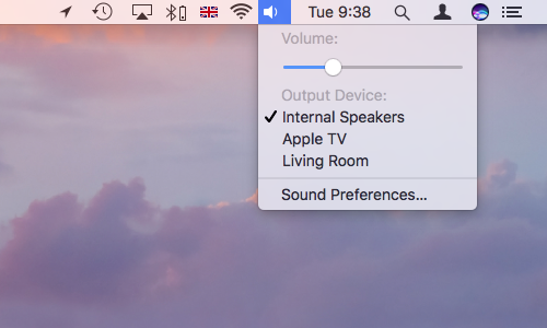
  IMO, the last version looks better than the current menu. That said, I think
the top/bottom paddings are still too tight, I would try adding 2-3px for each.
  It's true that there's a question of taste but more whitespace is generally a
good thing (unless you go overboard and start making huge widgets). A couple
more pixels in the menus will help focus the elements better (by framing them
in negative space), it will make the ui look less "full of stuff" and less
tense.

  For reference:

  Material design manual:
https://material.io/guidelines/components/menus.html#menus-usage
  Gnome: http://i.imgur.com/er2odvE.png
  Mac:
https://www.intego.com/mac-security-blog/wp-content/uploads/2016/12/Mac-menu-bar-extras-sound.png
  Windows:
https://docs.microsoft.com/en-us/windows/uwp/design/controls-and-patterns/menus

REPOSITORY
  R31 Breeze

REVISION DETAIL
  https://phabricator.kde.org/D10438

To: zzag, #breeze, #vdg, ngraham, hpereiradacosta
Cc: januz, fabianr, mmustac, abetts, anemeth, plasma-devel, ZrenBot, progwolff,
lesliezhai, ali-mohamed, jensreuterberg, sebas, apol, mart