Hi Sébastien,

thanks for your mail ... so let's continue the small discussion we had
offline.
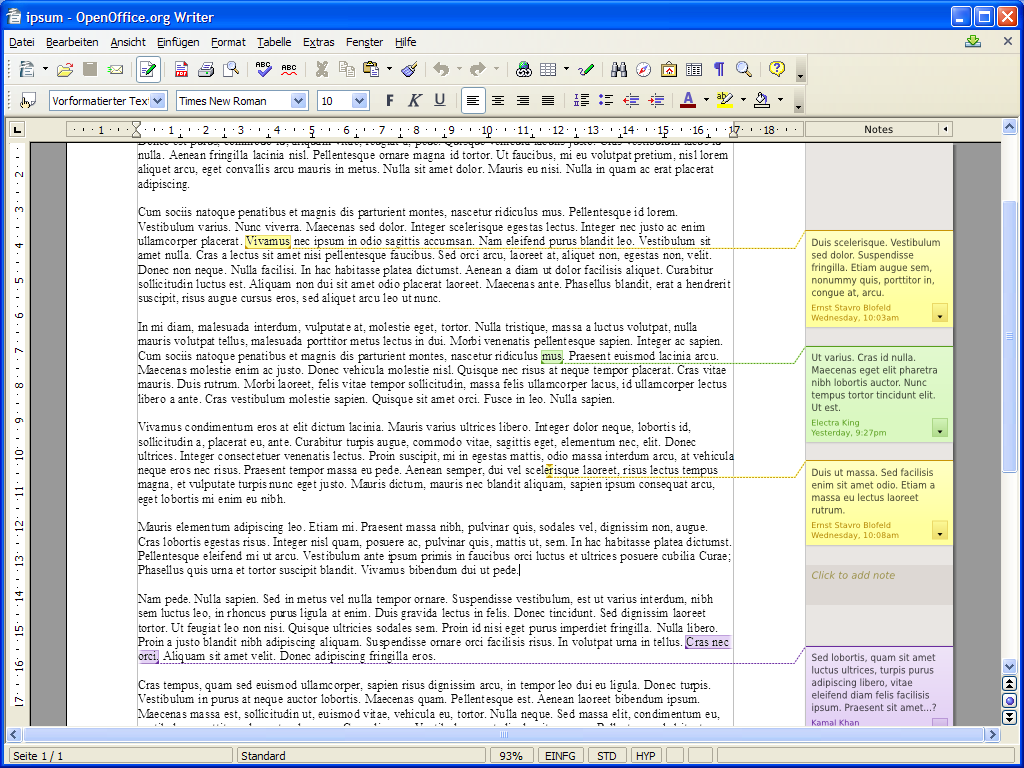
Am Freitag, den 04.03.2011, 08:42 +0100 schrieb Sébastien Le Ray:
> Le Thu, 03 Mar 2011 21:35:11 +0100,
> Christoph Noack <[email protected]> a écrit :
> > Am Donnerstag, den 03.03.2011, 14:16 +0100 schrieb Sébastien Le Ray:
> > > Le Thu, 03 Mar 2011 11:59:19 +0000,
> > > Michael Meeks <[email protected]> a écrit :
[...]
> > Personally, I've already spend over one year with the Notes project
> > being the UX representative, so I'd like to work with you on that - if
> > you like :-)
>
> I'll be pleased to :) It'd be nice to have a "UI tasks" on libreoffice
> wiki presenting all tasks that are ready on a Design point of view but
> that have not yet been implemented.
> There is a lot of stuff on the Note2 wiki page, could you give
> priorities on various items?

Mmh, hard to say ... because it might also depend on the effort that has
to be spend on your side.

But let's give that a try - it helps me to differentiate between issues,
visual improvements, and feature enhancements.

ISSUES

(Medium) Although invisible, this would be a great fix:
http://openoffice.org/bugzilla/show_bug.cgi?id=85844

(High) The small triangle (note anchor) still looks a bit awkward.
Originally, I tried to come up with a proposal that suits different
kinds of anchors (see also below). Here is a screenshot for the I-shaped
anchor (in the center of the graphic) that should replace the current
triangle.
http://wiki.services.openoffice.org/wiki/Notes2_Design_NoteAnchor#Proposal_.22Boxes_.28Note_Anchor_Area.29.22

VISUAL IMPROVEMENTS

(Low) The implementation does not always follow the initial design - for
several reasons. If you look at the screenshots, you may spot some
differences (e.g. "dashed line" vs. "dashed line above normal stroke
line", or 2px width between Notes Sidepane and document vs. requested
1px width). Small things, but they improve the overall impression.

(Medium) Something between "issue and visual improvement" is to get rid
of the plain background when notes are edited. Originally, we wanted to
keep the gradient for all states.

(Medium) Since you've already invested some time into the nice "shadow
thing", the understandability of focus would be greatly enhanced by ...
http://wiki.services.openoffice.org/wiki/Notes2_Design_Visualization_of_Focus#Proposal_.22Increased_Shadow.22

FEATURE ENHANCEMENTS

(High) One of the most important requests for Writer is still to have
proper Notes printing. On the first glance, it might be invisible to the
users, but when printed - it will shine :-)
http://wiki.services.openoffice.org/wiki/Notes2_Design_Printing

(Medium) Today, we only support note anchors representing "one
character". We miss the functionality to markup a word, or even a whole
sentence - the note anchor areas. Screenshot below - but there is also
some detailed description on the behavior of such a feature.
http://wiki.services.openoffice.org/wiki/Notes2_Design_NoteAnchor#Proposal_.22Boxes_.28Note_Anchor_Area.29.22

(Medium) Another nice thing would be a Notes ruler control that enables
the user to show/hide the Notes:
http://wiki.services.openoffice.org/wiki/Notes2_Design_NotesSidePane#Proposal_.22Notes_Ruler_Control.22

(Medium) My personal favorite - which seems unique among the office
suites - is still the "notes placeholder". This is a decent placeholder
that enables to just start typing the notes text after having clicked on
it (anchor would be placed at current document text position, the
placeholder has the same size as a freshly created note). Here is a
preview:
http://wiki.services.openoffice.org/w/images/8/81/Notes2_2007-09-08_GeneralMockups_View.png

And so on, and so on. Does that help somehow?

[...]
> http://wiki.documentfoundation.org/Design
>
> Subscribed yesterday :-)
> It seems that you've been busy with more "marketting" stuff that UI
> design lately to cover the launch of LO, FOSDEM and funraising

Cool, great to have you here ... aehm ... there. And you are right with
your "busy" assumptions. Especially the "funraising" seems to be the
hardest part in this project ;-)

> Waiting for you priorities & mockups on notes work :-)

Hehe, thanks a lot! Great to hear that ...

Cheers,
Christoph

_______________________________________________
LibreOffice mailing list
[email protected]
http://lists.freedesktop.org/mailman/listinfo/libreoffice