Hi all

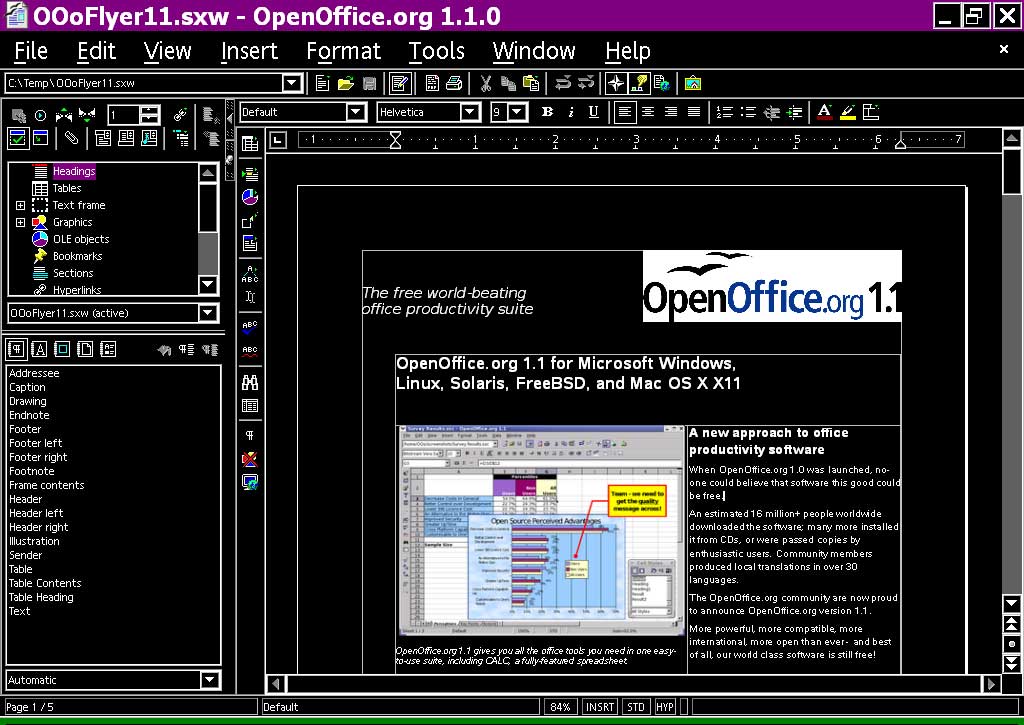
I tried modifying official hicontrast theme (I choosed default one just
because it was in the repos and easy to test )
. Hicontrast is a good basis because It's maybe the more complete theme of
all.
Here is the result for 5 icons : http://ubuntuone.com/7HLYSzrN8lfimbXLYUiOw5
I used Android Guidelines colors, as adviced by Mirek (I didn't choosed
well colored / non colored parts, but it's a first start to see whether
it's possible to have something OK based on highcontrast, easily)

I tried using little and big icons sizes, they are or too big or too little.

Link to high contrast theme : http://ubuntuone.com/4UaF2dRGZS87xL1qMOGlc0

So, how to decide whether we use - or not - monochrom icons ?

Kévin

2012/2/22 Christoph Noack <[email protected]>

> Hi again,
>
> I think I need to reply to my own mail ;-)
>
> Am Mittwoch, den 22.02.2012, 19:29 +0100 schrieb Christoph Noack:
> > Hi all,
> >
> > I'd like to avoid to give an opinion on whether a monochrome icon set
> > does make sense, but ...
> >
> > Am Mittwoch, den 22.02.2012, 18:47 +0100 schrieb Kévin PEIGNOT:
> > > > In terms of implementation, i believe that it would be a save of
> time and
> > > > effort if we begin with using an existing theme.
> [...]
> > > Great Idea. And then making one icon set (I mean color) and including
> this
> > > script in the software to generate the others colors ? Should we ask
> on dev
> > > mailing list if this is possible / if it would need lot of CPU/memory
> > > resource
> >
> > I don't think that will work well given our massive number of icons and
> > the need for easy understandability. Even today, scalable icons (SVG)
> > are not used for small icon sizes, because these need to be tweaked by
> > designers to achieve reasonable quality. So, removing the information
> > channel "color" automatically might not lead to sufficient results.
>
> Kévin, I've read your mail again and noticed that Mirek makes decent use
> of colors in his mockup. That made me think of the High Contrast icons /
> graphics I was working on some time ago - maybe a good starting point
> would be the High Contrast theme. The number of colors is rather low, so
> it should be possible to reduce the contrast a bit (maybe also
> exchanging some colors), so that the desired effect of monochrome icons
> can be realized rather easily.
>
> Please have a look at one of the graphics (randomly chosen):
> http://www.openoffice.org/dev_docs/features/1.1/images/accessibility.jpg
>
> On the plus side, using the old Galaxy HC icons would bring us better
> icon quality than we have today with the Tango set (that lacks some
> icons in the less used places).
>
> > However, wouldn't be easiest thing to pick some icons and to use a
> > graphics program like "The Gimp" to apply some effects to continue the
> > discussion?
> [...]
>
> Finally, sorry for the additional mail ...
>
> Cheers,
> Christoph
>
>
> --
> Unsubscribe instructions: E-mail to [email protected]
> Problems?
> http://www.libreoffice.org/get-help/mailing-lists/how-to-unsubscribe/
> Posting guidelines + more: http://wiki.documentfoundation.org/Netiquette
> List archive: http://listarchives.libreoffice.org/global/design/
> All messages sent to this list will be publicly archived and cannot be
> deleted
>

--
Unsubscribe instructions: E-mail to [email protected]
Problems? http://www.libreoffice.org/get-help/mailing-lists/how-to-unsubscribe/
Posting guidelines + more: http://wiki.documentfoundation.org/Netiquette
List archive: http://listarchives.libreoffice.org/global/design/
All messages sent to this list will be publicly archived and cannot be deleted